Showing posts with label reviews. Show all posts

Accessorize Review and Swatches

Posted by Erin on 11/2/11. Filed under: , ,
3 Comments


I've been lucky enough to get my hands on quite a few of Britains more popular drugstore brands of polish. One of the brands that was on the top of my "UK Polish Wishlist" was Accessorize. After perusing the Super Drug website, I was completely smitten by the brand. So did Accessorize meet my expectations? Hmmm....

Let's start with the good.

Indigo
Accessorize makes a good variety of colors that aren't typical of those found in American drugstores. For example- how often do you find a soft peach creme shade in your local CVS? It's probably never happened. I can't think of a single one. But Accessorize not only produces those kinds of shades, but they also have a line of really incredible duochrome glass flecks. I am sad to report that I have not had the chance to try any of those out though :(

Coral Flair
Accessorize polish is also very pigmented. The colors are rich and opaque in 2 thin coats. The only one that I had an issue with was Apricot Crush, which requires FOUR coats due to streakage.

Now for the bad...

Apricot Crush

The bottle size is a buzzkill. Being an American, I'm used to the standard .5oz bottles of polish, but that is not the standard in Europe, as I've noticed. Accessorize polishes are 10ml, which is small. This also means that the brush is small. And on top of that, the top of the bottle/brush is as wide as the bottle itself, which makes application a bit awkward. So in short, the packaging is not ideal.

Pillar Box

Accessorize retails for £4.00 at Super Drug in the UK. If you have the opportunity to try this brand, I would urge you to go for it. But be prepared to receive a tiny amount of product in an awkward bottle ;)

Sally Hansen - Pumpkin Spice

Posted by Erin on 10/31/11. Filed under: , , ,
No Comments »

Happy Halloween to all of you who actively celebrate it. I rarely do anything special for Halloween myself. Last year I went to a party and drank almost an entire Heineken mini keg that was strapped to someones back (he was dressed as a scuba diver). Each time I went to fill up my cup, I'd ask if I could "tap that ass" (Get it? Hur hur derp). I spent the entire next day hating myself and nursing a hangover. This year I'm curling up in bed with some Real Housewives instead. There's slightly less self hatred involved in that. Slightly


I know I promised some Halloween nail art but the truth is I just wasn't feeling inspired. So instead, I give you Pumpkin Spice from Sally Hansen. 

Color: 
Greenish greyish jelly base with orange glitter. A close dupe of ChG's Ick-a-Bod-Y. 

Application:
Meh. It's incredibly sheer and required 4 coats for opacity, which I wasn't happy about. But each coat dried pretty fast so I guess that's a plus. 


Downside:
It's sheer as hell, as I just stated. You might want to just layer it on over a coat of black. 

Bottom Line:
This is a pretty good dupe for Ick-A-Bod-Y (which I LOVE), but there are some major differences in the formulas- both good and bad. First, Ick-A-Bod-Y is much more opaque than Pumpkin Spice. It's a 2 coater. So in that aspect, Ick-A-Bod-Y wins. But Ick-A-Bod-Y is also very very gritty and eats top coat in a matter of seconds. Pumpkin Spice is actually quite smooth and has more depth to it because of that. 

So while Pumpkin Spice is a real pain in the ass in regards to opacity, it's also a keeper. I still love my Ick-A-Bod-Y though, and would probably choose it over Pumpkin Spice if I had to make a decision. 

And just for the hell of it, here is Pumpkin Spice with a layer of Hard Candy's Mattely In Love over it:

Fantasy Makers - Vamp Red

Posted by Erin on 10/30/11. Filed under: , , , ,
3 Comments

It's winter already here in Boston. Last night it snowed, and I had to turn my heat up to 75 degrees this morning. I now have to do swatches between the hours of 12 and 4pm due to the dwindling daylight hours. 


If you don't already live in New England, I would not suggest you move here. It wreaks havoc on your mental and emotional states. I can only imagine what it must be like to live in Alaska or Scandinavia. Just thinking about it makes me want a xanax. 

I suppose the one good thing about the colder weather coming in is the influx of new polish collections. I still wish that mother nature had held off on the snow until after Halloween though...

Speaking of Halloween, I should probably stop yapping and complaining and show you todays polish. It's Vamp Red from Fantasy Makers and I was lucky enough to find it at CVS. Normally the CVS near me is a total flop when it comes to nail polish. They never even got the Sally Hansen Halloween nail strips. Basically, they're lame and there isn't a single polish in the place that I don't already own. So when I saw that they had a Fantasy Makers display, I was pretty happy. No Creepy Pumpkin though :( Sucks. I really wanted to buy a backup of that.

Color:
They don't call it Vamp Red for nothing. It's an incredibly deep dark wine color. It looks a lot like a creme but it has a tiny amount of shimmer in it that's mostly invisible to the naked eye.

Application:
Not bad at all. Drying time is a little slow though.

Downside:
There's some color bleed around the cuticles. Not a huge deal, but not a positive either. And again, the top to this does not align properly when you twist it as tightly as it should be. Why the hell didn't they fix that problem???

Bottom Line:
Vamp Red isn't a totally unique color or anything, but I'm glad I bought it. Application is better than many other wine shades I've tried, and it only costs $1.99. Plus it comes in that cute tombstone bottle.

Sinful Colors - San Francisco

Posted by Erin on 10/28/11. Filed under: , ,
1 Comment

I took some photos of a few more Halloween polishes that I bought this week, but I'm really unhappy with the pictures and will have to re-swatch over the weekend. *sigh* I was all set to make 3 posts and schedule them to post all weekend and then my shitty photography skills ruined everything. To be fair though, it's half my cameras fault. It hates red :(

Luckily though, I did manage to get some decent photos of Sinful Colors' San Francisco. If you're looking for a cheaper alternative to some of the holly jolly Christmasy greens coming out, just head on over to Walgreens and pick this up.

Color:
An emerald green super shimmer.

Application:
It's a bit sheer, but easy to control. Requires 3 coats for opacity. Dries a little slower than I would have preferred.

Downside:
Brushstrokes, brushstrokes, brushstrokes! Some people don't mind them, but I absolutely loathe visible brushstrokes. To me, it ruins the whole look. And as you can see, San Francisco is plagued with them. This is a classic example of why I normally steer clear of shimmers. HOWEVER...something about this color makes the brushstrokes more tolerable. Maybe because it's so festive looking???

Bottom Line:
When it comes to Sinful Colors, it's basically a hit or miss. Some of their polishes are fantastic. Others get thrown in the untried pile and remain there for months and months because they just don't measure up. But hey, what can you expect for $1.99?

San Francisco is a hit rather than a miss. Yeah, I dislike the brushstrokes, but it's still a stunning color. I do think it's a color best left to the holiday season though.

Petites - Utopia

Posted by Erin on 10/25/11. Filed under: , , ,
No Comments »

Yesterday I took a quick trip to Rite-Aid while I was out running some other errands. I was searching for the pumpkin polishes, but they were nowhere to be found. All was not lost though, because I finally found Sally Hansen's Pumpkin Spice and was able to pick up a few other polishes as well. One of which is called Utopia from Petites.


Color:
Bright teal green that I guess could be classified as glass flecked, but the effect isn't quite as strong as most of my other glass flecked polishes. I suppose it just has more regular shimmer and less glitter than some others.


Application:
Very smooth and easy to control. It's pretty sheer though, so I used 4 thin-medium coats. Drying time was a tad longer than I'd have liked. The wrinkle you see on my index nail is due to the top coat I used (Revlon Quick Dry), but that's a story for another day...


Downside:
This actually has a duochrome effect. Or...at least it DID have a duochrome effect. In person you can see it in the bottle and again when you first apply it to the nail, but for some inexplicable reason it disappeared after a few hours. I know I'm not imagining things. It's a really pretty purple flash and I planned on having beautiful pictures of it. What the hell happened?! Where did it go?!


Bottom Line:
Jessie's Girl (also sold at Rite-Aid) has a much better teal glass flecked polish. It's called Glee. I'd recommend that one over Utopia due to it being much more pigmented and blingy. The reason I bought Utopia was due to the purple flash it had in the bottle...but, as I said, it disappeared. Not a bad color though. It's just not what I expected it to be.

China Glaze - Weekend Warrior + Awesome Blogs

Posted by Erin on 10/20/11. Filed under: , , ,
4 Comments

I'm wearing another great shade from China Glaze's Metro collection today. This time I'm wearing Weekend Warrior. I can't get enough of these rich greens this fall. And at this point I probably have more greens in my collection than any other color, which is weird since I'm not a super fan of the color green in general. I just enjoy it on my nails for some reason. Oh well. Onto the review and swatches!

Color:
Very rich dark olive green creme. This is the perfect shade for your Army camo nail art.

Application:
Again, China Glaze has a superior formula and Weekend Warrior reflects that. It's smooth, non-streaky and opaque in 2 coats. Many colors that are this dark and pigmented are tough to control and can bleed around the cuticle, but there are none of those kinds of issues here. Excellent.

Downside:
Absolutely none.

Bottom Line:
Westside Warrior is a perfect fall shade and a great addition to any polishaholics collection. I may have to learn how to do a camo design just so I can utilize this to it's full potential. I also think it'd look nice in a french mani. Add those to my list of future nail art designs.

-----------------------------------

I wanted to share some links with you guys, because although I subscribe to quite a few blogs, the truth is that I normally only have time to visit a handful of them on a regular basis. That said, I do make it a point to check out all of my commenters blogs.  In fact, A few of my regular commenters have some really cool manis going on at present and if you're looking for Halloween inspiration, look no further. 

- Midnight Manicures has great nail art on her blog. I especially love the blood spattered skull design.

- Fellow Bostonian, Alexisaurus, has the coolest zombie nail art up right now. Can we get a tutorial, Alexisaurus?  :)

- Fingers did an intricate spider web design that makes me a little jealous.

- Rin doesn't seem to have done any Halloween designs just yet, but she's super nice and has great swatches.

China Glaze - Trendsetter

Posted by Erin on 10/16/11. Filed under: , ,
2 Comments

When the new collections come out I usually don't feel compelled to buy every single shade. ChG's Metro Collection was no exception. But there were a few in there that I had to have. Trendsetter was #1 on the list. Every swatch I saw made me freak out in anticipation. It did not disappoint.

Color:
This is a mustardy pea soup green with golden shimmer. Normally a pea soup green polish would come off looking funky and "alternative" (for lack of a better word). This doesn't because it has a lot of warmth to it.

Application:
China Glaze almost always hits the mark when it comes to formula, and Trendsetter is certainly no different. It applied like a dream. It's super easy to control, not streaky, and opaque in 2 coats. Drying time was average.

Downside:
None here.

Bottom Line:
I'm not sure what else I could say about this that I haven't already covered, so I'll just tell you that everyone should have this one in their collection :)

I went ahead and took everyones advice concerning watermarks. The reason I never added them before is because I feel like they ruin the photos. They just don't look as nice with text running through them. Not that my photos are awesome or anything. But I suppose it's a lot like locking your door at night. You aren't required to do it, but it's a good way to protect yourself.

Fantasy Makers - Creepy Pumpkin and Black Magic

Posted by Erin on 10/14/11. Filed under: , , ,
3 Comments

I think I might be the last person to do a Halloween post. I love reading everyone else's and I especially love the nail art I've seen. I have yet to come up with any fresh ideas for Halloween nail art, but when I do I'll post them. Until then, I do want to share these 2 colors from Wet n Wilds Fantasy Makers line. I actually took these photos over a week ago but never got around to posting them. 

This is Creepy Pumpkin:
Color: 
Orange jelly with golden shimmer. I am really impressed with this. I've never seen such a true jelly turned into such a true shimmer before. Usually those turn out to be glass flecked, but this one isn't. Does anyone know of any others like this? I'd love to have more in my collection with this type of finish.

Application:
When I called this a "true jelly", what I meant by that is that not only does it have the high shine and sheerness of a jelly, but it's also on the thick side with a slightly gel-like consistency. So it creates a pretty thick layer on the nail, which obviously adds to a slow dry time. BUT, because it has all that great shimmer added in, it's not streaky like it otherwise might be.

 Downside:
These don't close properly. When you screw the top back onto the bottle, the tombstone shape no longer aligns with the bottle the way it should. Not a huge deal, but an issue that I would have thought they'd have remedied. Maybe mine are defective?

Bottom Line:
Creepy Pumpkin is awesome. It's unique to me and I wish I'd thought to pick up another bottle. Hopefully they're still available by the time I go back to the store. 

This is Black Magic:
Color: 
Black creme base with a strange array of glitter added. There's orange (which actually turns out to be more of a peach), green, and I think I might spot some blue in there too.

Application:
No issues to speak of, really. But...

Downside:
I'm not sure if this will make sense to anyone else, but this polish just feels cheap to me. I don't necessarily think that it looks cheap, but the formula is very reminiscent of an old Wet n Wild that you kept in the bottom of a junk drawer, and by the time you get around to giving it a nice shake and applying it, the pigment had already separated and it's just a big fail. That's what this reminds me of.

Bottom Line:
I could take Black Magic or leave it. It's not bad, but it's not great either. When I slapped my SD card into my computer and loaded up iPhoto I had a better appreciation of it though. In person it just wasn't dazzling. In the photos it actually looks a lot nicer.

I look forward to doing a few more Halloween posts before the 31st. For some reason none of the drugstores in my area are carrying most of the halloween polishes though. I haven't even managed to track down any of the Sally Hansen nail strips, and I really wanted the skull printed ones. Perhaps I'll make a trip to my sisters house this weekend and use it as an excuse to raid the (much better than the one near me) Rite-Aid that's on the way. If not, I guess I'll have to come up with some nail art!

OPI- The Muppets Collection (full swatches and review)

Posted by Erin on 10/12/11. Filed under: , , , ,
1 Comment

My boyfriend bought me The Muppets Collection from OPI last Friday, and to my surprise it arrived at my doorstep early this afternoon. I was anxious to try them all out and show off my swatches, so I spent pretty much the entire afternoon swatching the hell out of this collection. 

Some of these colors didn't strike me as being amazing in the bottle, but it turns out that those same colors actually ended up being my favorites. This is a collection that is full of fun finishes and tons of glitter. I'm really pleased with it. 

Now onto the swatches...
Designer, De Better!


Designer, De Better! is a silver based foil with flecks of copper added into the mix. I wasn't excited about this until I put it on. It ended up being one of my favorites. Like most of the polishes in this collection, it required only 2 coats for opacity and was easy to control.

 Warm and Fozzie


Warm and Fozzie is a bit hard to decipher. I'm fairly certain that the base is a sheer tan/brown shade. The shimmer particles are a combination of gold, bronze, and a hint of a duochrome(?). Whatever it is, it's nice. This took 2 coats for opacity. 

Pepe's Purple Passion


Pepe's Purple Passion is a strong, super pigmented burgundy creme with reddish pinkish flecks. Great color, but the formula is kind of odd. It dried in a patchy fashion and I got some dragging when I applied the second coat. It also ate my top coat. Worth the headache though, because it really is an exceptional shade. Requires 2 coats for complete opacity.

Animal-istic


Animal-istic almost borders on a vermillion color. It's definitely red, but it's got a good deal of orange in it as well. And that makes sense, considering it's the color they named after Animal. Animal was one of my (short lived) nicknames in junior high, by the way. And then my friends decided that while my personality was "Animal-istic", I looked more like Prairie Dawn because I had long straight blonde hair that I parted down the center. But I'm getting side tracked now. Animal-istic, like I said, is a bright orangey red jelly with glass flecked shimmer. It applied extremely well and again, required only 2 coats for opacity.

 Wocka Wocka!

Wocka Wocka! is a pretty standard cardinal red shimmer. For some reason my camera hates the color red when shimmer is added, but these pictures are pretty color accurate- they're just a little distorted. Not a super unique color. This is 2 coats.

Excuse Moi!


Excuse Moi! is a rose colored jelly base that's dominated by rose colored glitter, but pieces of green, silver and gold glitter are thrown into the mix. A very odd combination. I think I might wish they hadn't added the multi colored glitter because the rose color by itself is nice, but the extra glitter is just strange. That said, I can't say I dislike it. I'm still trying to figure out how I feel about it. It kind of looks like vomit, and I'm not sure if that's a bad thing! This is 2 coats.

Divine Swine


Divine Swine is a clear base packed with small particles of magenta glitter and larger pieces of silver hex glitter. It's much more sheer than I think it ought to be. It took 4 coats to get it to be as opaque as it is in these photos, and it could have used another coat...and a magenta base. 

Gone Gonzo


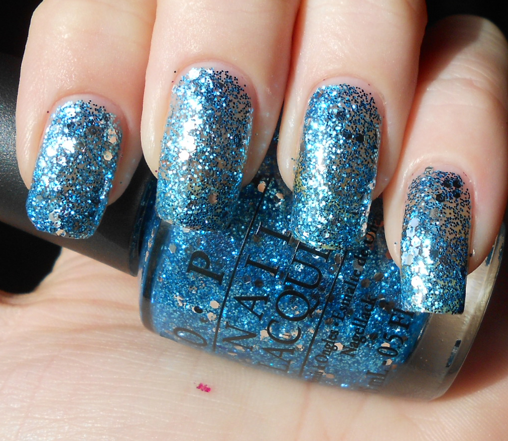
Gone Gonzo is identical to Divine Swine (and Fresh Frog of Belair), only the dominant glitter is blue instead of magenta. This is actually the only one of the glitters that I ended up being really happy with. For some reason it applied a little better than the others and the color is nicer IMO. This was also the one I declared as my favorite before even trying any of them out. This is 3 coats. 

Fresh Frog of Belair


Fresh Frog of Belair is just like Divine Swine and Gone Gonzo...only it's kelly green. This has the cutest name out of all of the polishes in this collection. It's also a cute color. I'll just be sure to layer this over a more opaque shade of green in the future. This is 3 coats.

Gettin' Miss Piggy With It


Gettin' Miss Piggy With It is a little different than the other 3 glitters of this type. It's a tad more opaque than the others and in addition to the red and silver glitter, it also has some larger pieces of hot pink hex glitter added in. This is a good holiday polish, but again, I will likely use a red base before applying this for a full mani. This is 3 coats. 

Rainbow Connection


Rainbow Connection is a clear base with silver, red, magenta, gold, green, blue and orange glitter of varying sizes. This appears to be the breakout star of this collection. Personally, I would have liked to have seen this without the silver glitter. Or at least not as much of the silver glitter. We've seen quite a few versions of this from other companies and everyone gushes over them. The way I feel about these kinds of polishes is similar to my thoughts on the crackle/shatter craze- I just don't get it. It's okay, but it doesn't stop me dead in my tracks. Again, if they had made this without the silver (or replaced the silver with stark white!) then I think it might have stood out more among the other versions we've already seen from other brands. This is 4 coats. 

The only polish from this collection that I left out was Meep-Meep-Meep, and that's because the photos I took of it were not color accurate at all and although I currently have it on as a full mani, the weather does not permit me to photograph it again today. I certainly have plans to take more photos of it though and do a full swatch/review of it because it turned out to be one of my favorites. So look for that sometime in the near future :)